HTML, CSS, JS
Thursday, September 26, 2024
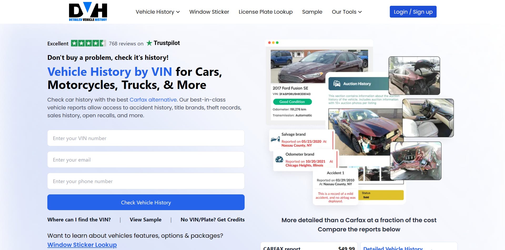
Home Page Design (DetailedVehicleHistory.com)
This is the main website for Empire Pixel Company. We redesigned it using custom HTML, Tailwind CSS, and JavaScript to create a modern, high-speed site. The focus was on responsiveness and SEO optimization, ensuring a smooth user experience and strong search rankings.
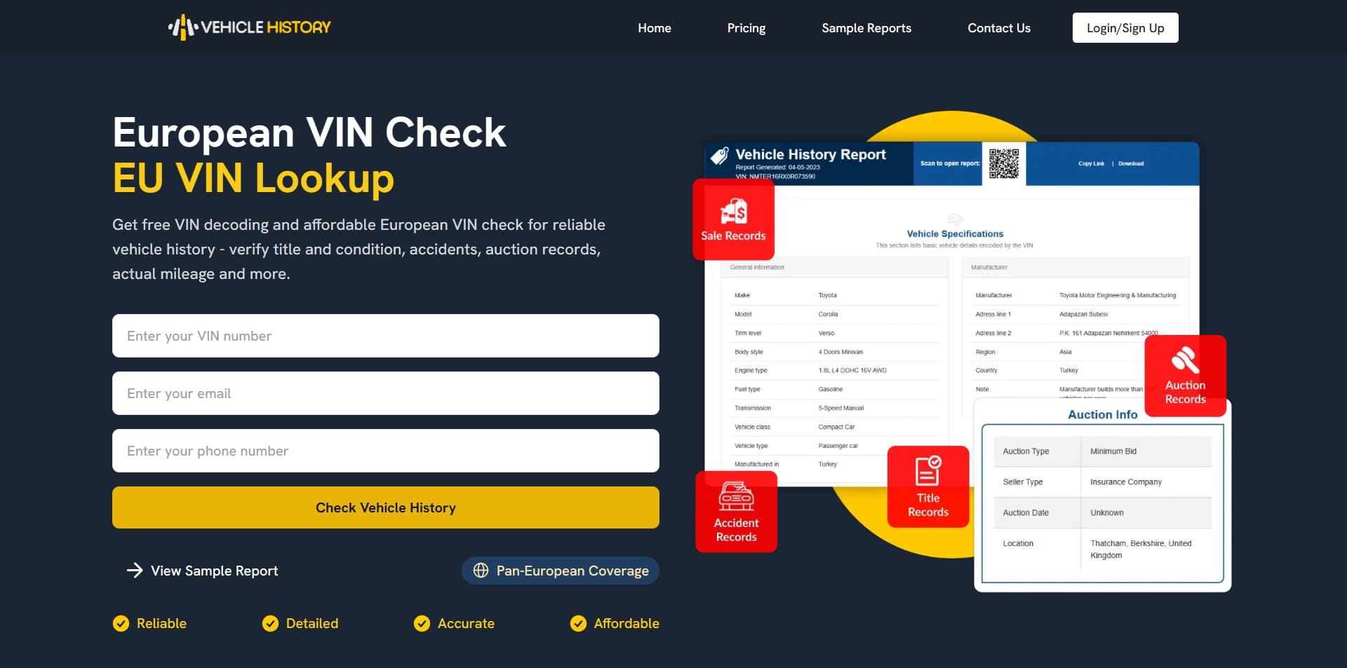
Home Page Design (VehicleHistory.eu)
This project is for a vehicle history website targeting EU visitors. We redesigned it with the same tech stack—HTML, Tailwind, and JavaScript—to enhance speed and maintain a modern look. The site is fully optimized for SEO, making it crawler-friendly for better visibility.
Fitness Quiz (Landing Page)
This was a pretty fun project to work on! It was a unique experience for me to create a landing page like this, which is usually built using ClickFunnels or other landing page CMS tools. However, in this case, I was asked to build it using only vanilla HTML, CSS, and JavaScript—without any libraries.
It was quite a fun challenge. Not because it was hard (I knew from the start that I could create this), but because I had never built something like this before. Usually, I work on homepages or other standard pages, but this time, it needed to be a single-section landing page. It was a great project, and I managed to complete it in a short time while optimizing for page speed and mobile responsiveness.
Thanks for the project. Shoutout to Bogdan Ristic!

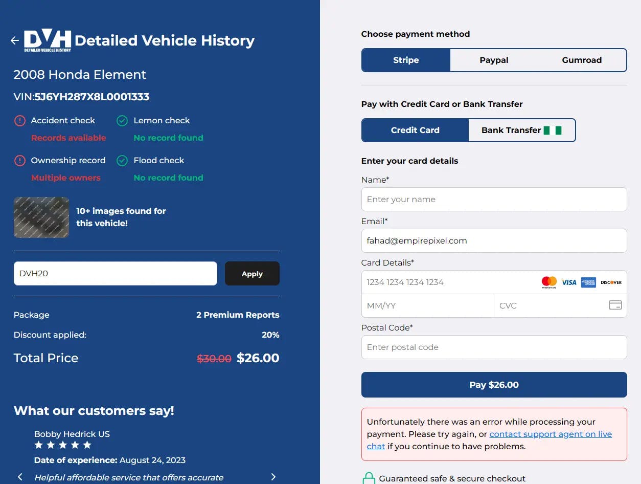
Custom Checkout
This is one of my favorite HTML, CSS, JS projects. I like the results I made here enough to dare to rank this project at number one (at least for now). In this project, my html checkout page is still in use until this page is published on the DetailedVehicleHistory website which you can search on Google (this website was created and actively managed by me until the moment this page was created). Well, let's go straight to the results, please see below.
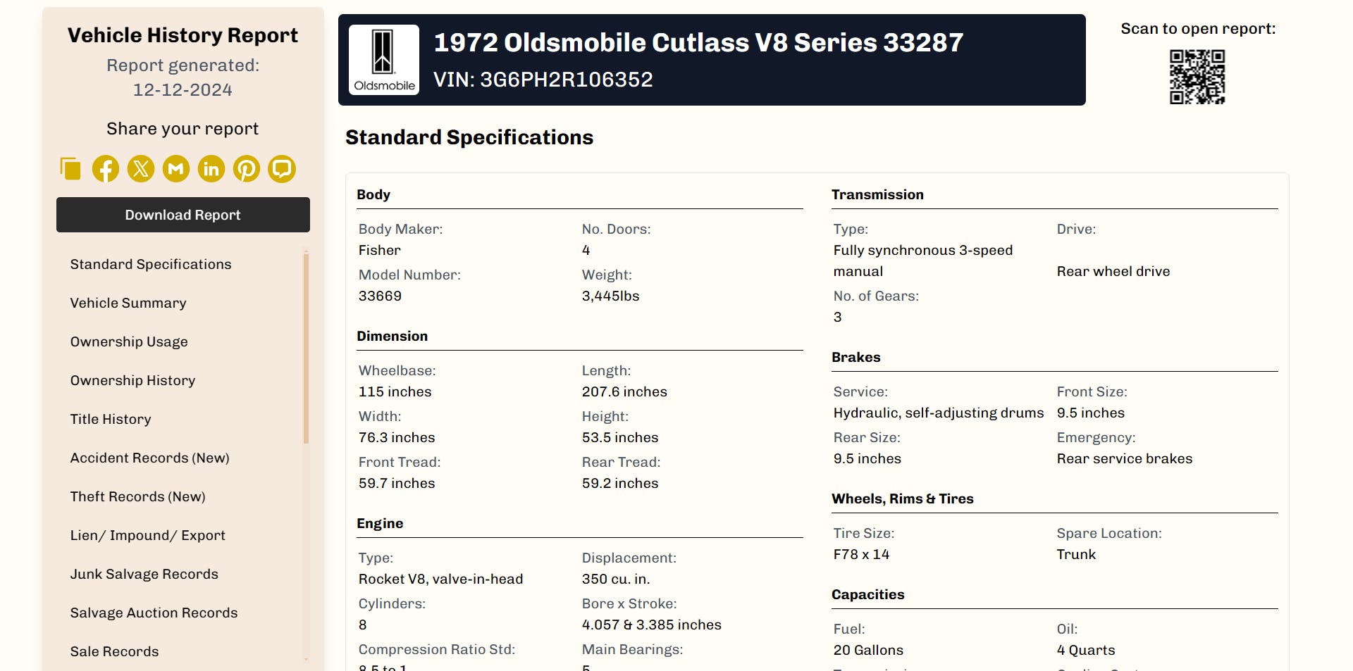
Classic Car Vehicle Report
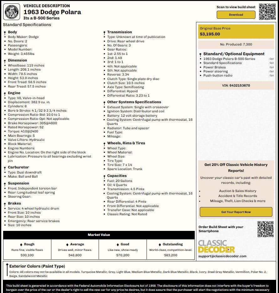
Next is a classic car vehicle report website for a client. The reports are displayed in HTML format and need to be well-organized for dynamic data handling using PHP and JavaScript. The page is also print-friendly, offering a slightly different but polished layout for printed reports.
Classic Car Build Sheet / Window Sticker
This project is for a window sticker product sold by my client. The sticker displays a car’s specifications based on user input. The HTML design is optimized for both dynamic data entry (using PHP and JavaScript) and a high-quality print version.
Vehicle Report Fusion And Panther
This is another version of the vehicle report, featuring a different style and theme from the client’s other websites.
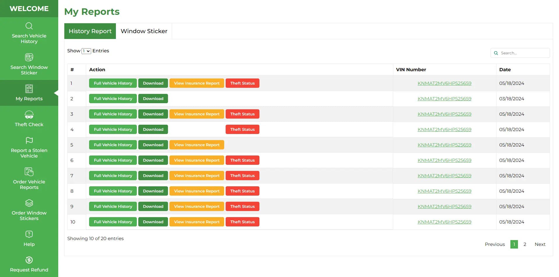
Member Area
The second is the member area. i almost forgot that i ever made this. in this project i was asked to create the frontend side of the member area using custom HTML, CSS, and JS that can be used effectively by the backend developer.
There were several pages assigned to me, but I will give you some of the best ones. please see the results below.
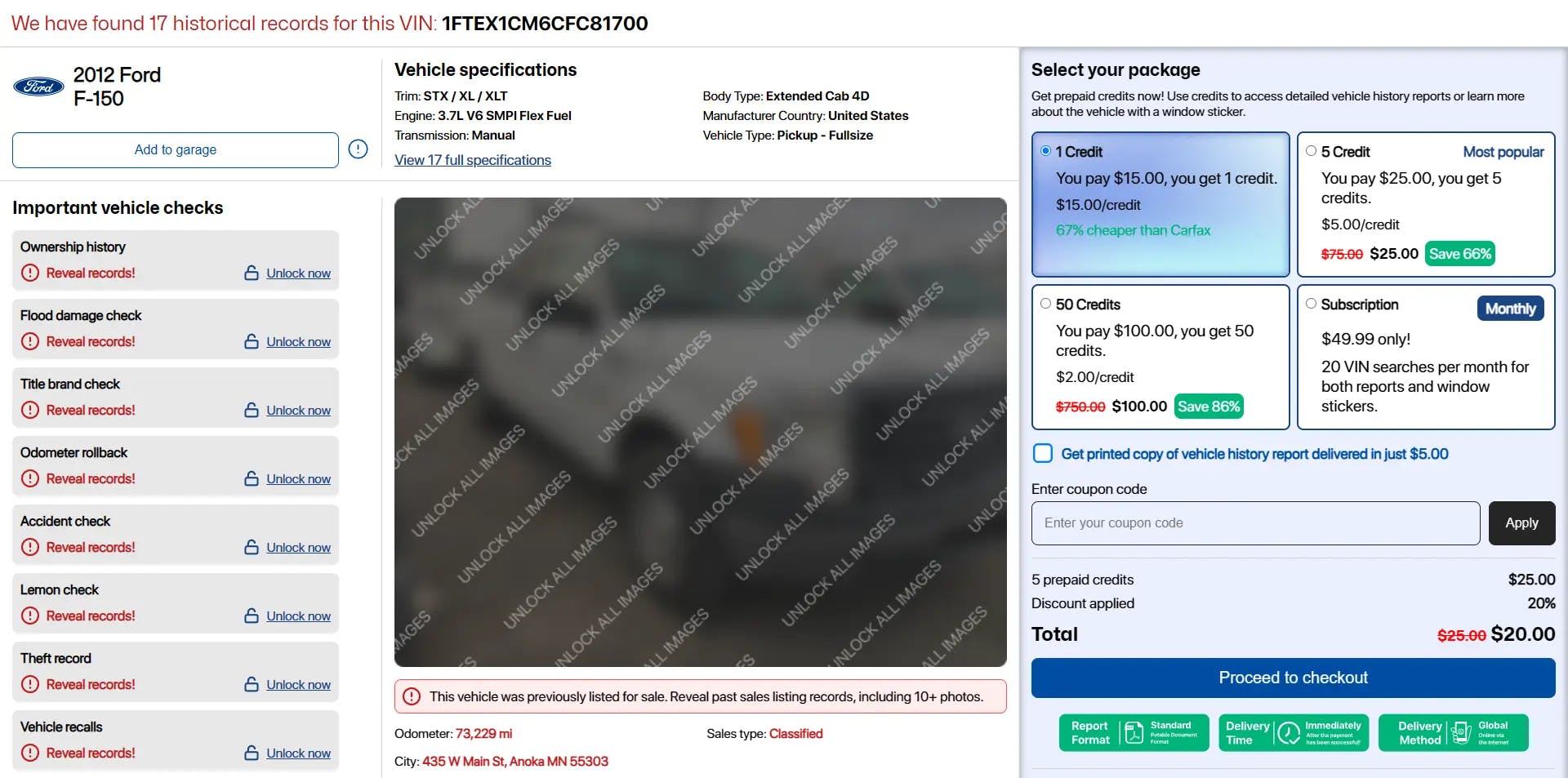
Preview Vehicle Report Page
Third is the preview page for the vehicle sales report, I was quite amazed that this sales report is quite sold in Canada and western states.
In this project, I was asked to create a responsive page that can still look good even if some parts of the section are deleted (if the data is not available). it was quite challenging and exciting for me, and anyway, this is the result.
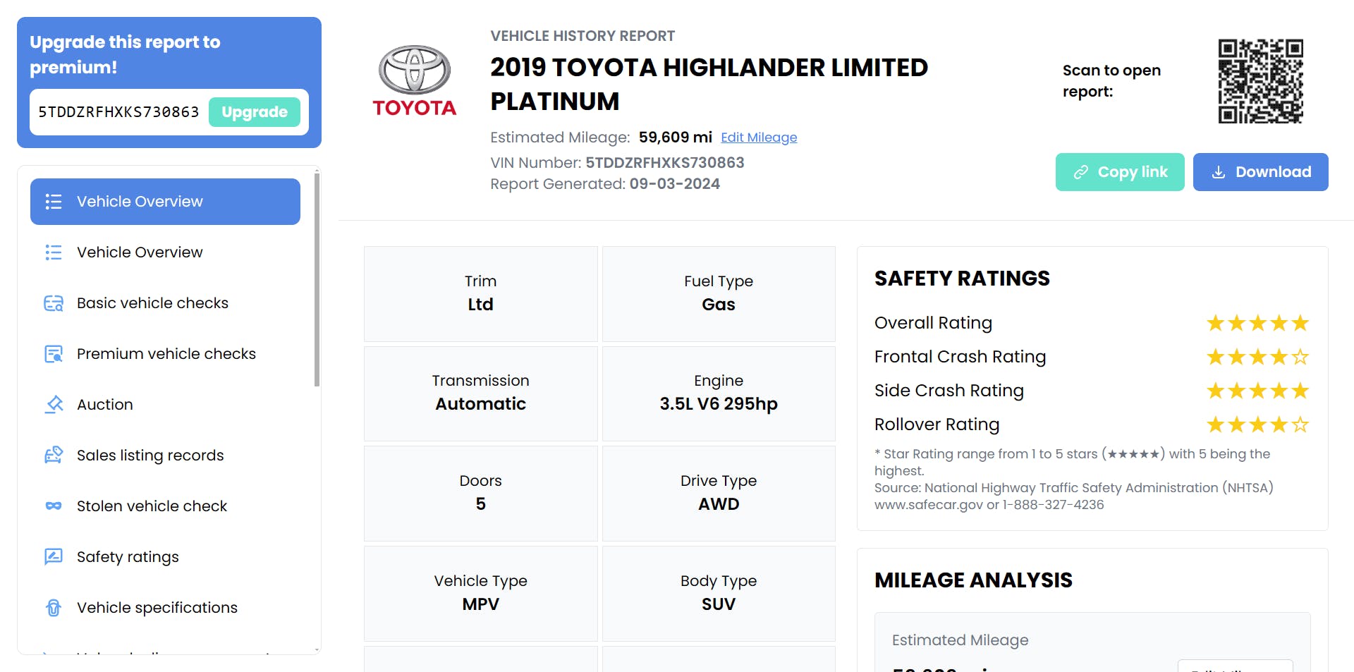
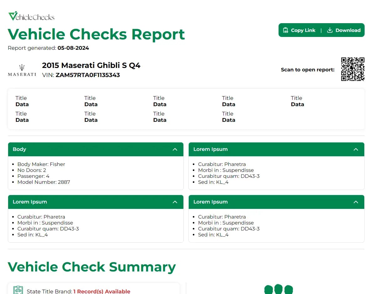
Vehicle Report
Not far from project 3, this can be said to be the next step of step three where this is the result after the customer buys it (the report itself). but you must have realized that the theme of this page is very different. Yes, it's true because it's different, in this project I was only assigned to make the report page because that's all I can show you.
this page is also still actively used by the website owner until the time this blog was published, you can find the website on the internet with the domain vehiclechecks[dot]net (Btw this website was created using WordPress and custom plugins that I also created)
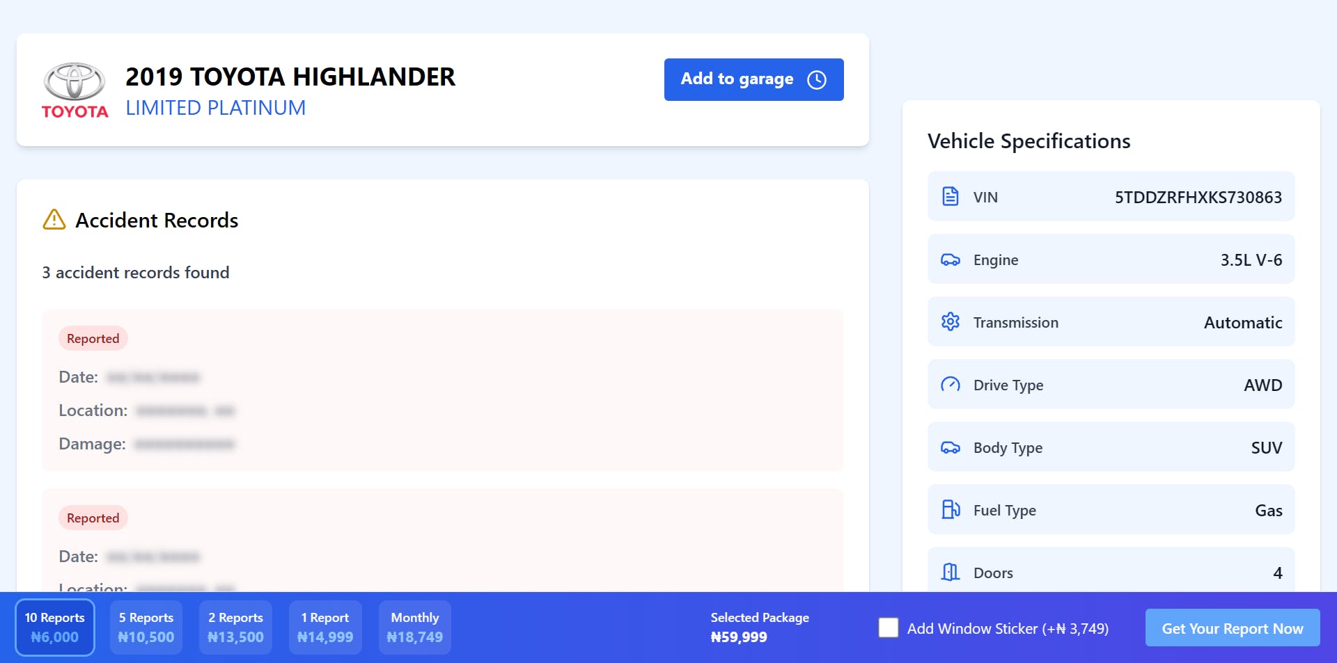
Accident Preview Page
This preview page helps guide users toward making a purchase. It showcases key data that interests the customer, encouraging them to complete the payment.
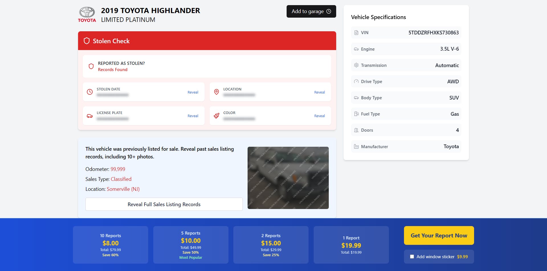
Stolen Preview Page
This preview page helps guide users toward making a purchase. It showcases key data that interests the customer, encouraging them to complete the payment.
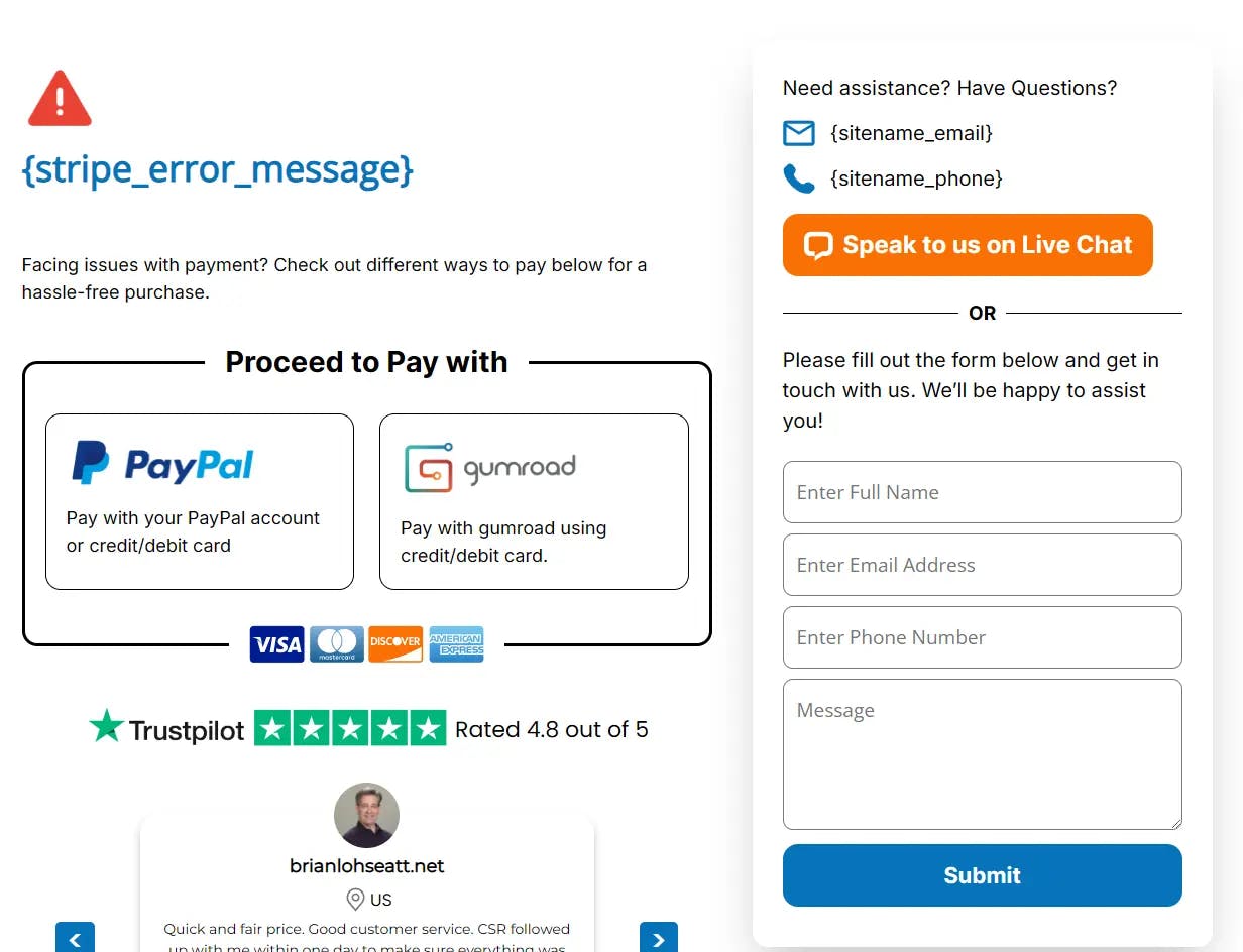
Stripe and PayPall Checkout Massage
the last is the error page when the customer experiences problems when making payments. just a few moments you must know why I put this at the end, first because the vibe is not good, namely the error situation, the second I also don't really like the design (but the design figure is like that and has been accepted by various divisions, I can't do much). okey so this is the result, don't look too long.
Alright, so those are some of the results from the custom HTML I created. Thank you for taking the time to view and read this page all the way through. If you'd like to get in touch or connect with me, feel free to click the Contact button on Navigasi Bar, and let’s see what happens. Thanks, bye bye!